The use of colors in marketing is one of the oldest tricks in the book — and we’re talking extremely old. Think about it: For millions of years, flowers have used colors to attract insects, drawing them in with welcoming, friendly hues to spark pollination. On the other hand, poisonous creatures regularly clad themselves in bright colors to ward off potential predators. This, too, is a concept as old as time. While the psychology of color in marketing is decidedly more complex, the same rules apply.
Colors can generate emotions in people, either to draw them in or to fend them off. Digital marketers are almost always looking for ways to attract the human eye, so combining a captivating message with a trendy color palette can be extremely effective.
How Advertisers Can Use Color Psychology
There’s a field of psychology that can help explain this interaction in depth: color psychology. In fact, researchers who study color psychology say there are emotions and psychological connections that can be measured, describing the way humans perceive a hue and how they react to it. These connections can be universal and apply to most people or personal due to relationships to past memories and experiences.
Color trends in marketing relate to the way people perceive color changes over time and across regions and cultures, evidenced by the fact that pink was once considered a “boy” color and blue a “girl” color. An advertiser hoping to make their mark in China would use a different set of rules governing the psychology of color in marketing than they would in the U.S. For the same reason, the popular advertising colors of the 70s don’t necessarily translate to 2021. (We’re looking at you, chartreuse.)
A thorough understanding of color trends can keep you on the cutting edge of color psychology and amplify your messaging in the process.
Here’s a look at some of the top color trends in marketing for 2021:
Organic color blocking
This trend takes the old-school concept of color blocking and twists it around, transforming the square color blocks of the past into abstract, asymmetrical shapes. You might remember the color-blocked windbreakers of the 90s — organic color blocking follows the same guidelines but trades in straight lines and sharp corners for more natural, softer shapes. One of the biggest advantages is you can make an existing color palette new again by showing it in a different context.
Human skin tones
The broad palette of natural human skin tones is in style thanks to pandemic-era values like compassion, empathy, and acceptance. It’s no longer trendy to represent human skin tones with just a few different shades, either. Using these design principles, brands attempt to capture the full breadth of the human experience with an emphasis on variety.
Heavily-saturated pops
When paired with a background of muted or pale colors, a pop of super-saturated color can really stand out. For 2021, focus on colors that promote a feeling of health, optimism, or rebirth. Try an energetic but pleasing green or orange — but avoid colors that are too intense or overly bold. This is a popular trend in branding design because it encourages the eye to go exactly where the designer desires.
Dreamy color replacement
People want an escape from the drudgery of lockdown life. Coat an object in an unexpected color to give the impression of a surrealist painting, removing some of the barriers between dreams and reality. Think of the pink elephants from Dumbo, and you’re on the right track.
Creating with cozy colors
We’ve all been just a little too connected to the internet and our screens over the past year or so. Give consumers a break and utilize subtle designs and cool, natural shades to bring them back down to reality. This trend eschews the digital age in favor of colors you might find in a garden or living room.
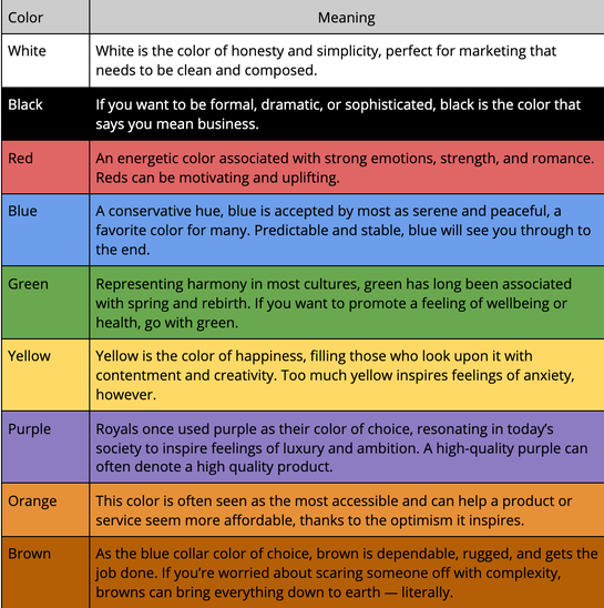
The Psychology of Color in Marketing Cheat Sheet
According to the London Image Institute, most common colors can be associated with certain feelings. When trying to bring legitimacy to a message, a peaceful blue might be your best bet, for instance.
Here’s a quick list of basic colors and what they might suggest to consumers:
![]()
Last updated on April 23rd, 2025.