Landing pages should be in every growth marketer’s toolbox since they're great at nurturing leads and converting customers. However, most landing pages aren’t working as hard as they could be. In fact, 77% of landing pages are just home pages that aren’t built for a specific goal or campaign — which means there’s much more companies can do to boost the effectiveness of their landing pages. Check out these tips for creating an impressive landing page that’ll convert customers and give any brand a great virtual storefront.
Define the Audience and Goals
Without a specific target audience and goal, a landing page serves very little purpose.
At the start of a landing page’s development, it’s important to define the audience and goals since they’re the foundation for everything else. You have to look at the offer, design, and layout, written content, headline, call-to-action (CTA), and even the pay-per-click (PPC) ad or social post that’ll lead users to the page. Identifying the audience and goal will also establish whether there’s a need for different landing pages for various audiences, and which messages will resonate best with each.
The example below from Masterclass shows a landing page that’s well-aligned to its target audience. Masterclass offers online video-based courses, and the landing page respects that identity by presenting a range of videos about its offerings while keeping the text-based content to a minimum.
Image: masterclass.com
Clear, Logical Headline
When a potential customer lands on the page, they should immediately have a clear understanding of where they are and what the product or service is all about. Landing pages are not the place for artsy abstractions and clever brainteasers. The message should be unambiguous, logical, and compelling. And the best way to do this is with a robust and straight-to-the-point headline.
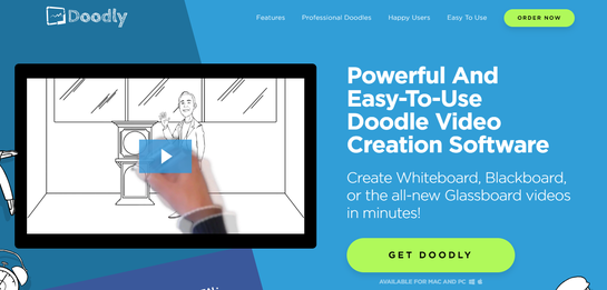
In this landing page by Doodly, the main heading clearly explains the product and the subheading just beneath expands on it with more information, and a unique selling proposition (“Create doodle videos in minutes”). Coupled with the embedded explainer video, the landing page offers a clear, simple explanation of their product and its benefits.
Image: doodly.com
Also, notice that the headline is a bold white against a contrasting blue background, so it’s easily seen and catches the eye.
Create Compelling Written Content
The written content on a landing page has one ultimate aim — to drive conversions. As a rule, the length of the written content on a landing page should correlate to what you’re asking the customer to do. If the conversion is downloading a free checklist, then a short landing page with a strong CTA should be enough. If the customer is being asked to purchase a product, the landing page will need to provide more detailed information to drive that conversion. This information could include things like product features, benefits, specs, how to use it, why it is better than the competition, even instructional videos.
No matter how long the landing page is, the content must be written in a way that compels the reader to action. One way to do this is by focusing on the customer’s pain points. How does the offering solve their specific problem?
Another way is to construct the landing page with incremental temptations using the following steps:
Start out with the customers’ pain points
Show statistics that prove how fantastic the product is
Display video testimonials featuring satisfied customers
Follow up with details for an irresistible discount
By gradually ramping up the benefits as they scroll, the landing page builds up power and persuasion for the user.
Optimize the CTA
An effective landing page provides a clear path that directly steers the reader towards the desired action — that means it needs a solid call-to-action.
One of the mistakes companies make with landing pages is the use of too many different CTAs, which can be confusing for potential customers. Putting multiple offers on a landing page has been shown to reduce conversions by up to 266%. Go back to point one (defining the audience and goals) and decide what action is most important. Then, create the CTA around that specific action.
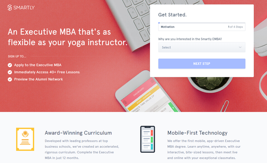
That doesn’t mean the CTA needs to be boring. There are plenty of ways to spice up a CTA, both in terms of attractive wording and design tricks to make the CTA button really stand out. There are always ways to make the CTA more creative and clever; consider the one below by Smartly.
Smartly employs an interactive CTA that asks the user a number of questions about why they’re interested in the MBA program, their current education, and their work status. Apart from providing a more personal and attentive user experience, the CTA also collects valuable lead generation data, which wouldn’t have been acquired with a standard “Submit email address” box.
Image: smartly.com
Build Trust
People typically don’t spend long on web pages — around 15 seconds on average. A landing page has to make a fast impression to be effective. The aim is to communicate the brand’s quality, demand, and desirability in an instant. One of the best ways to do this is to provide proof of all these things. This can be achieved with the help of trust badges from organizations such as Better Business Bureau, quality accreditations such as ISO, and industry membership seals. In B2B, a popular technique is displaying the logos of prominent companies that are already customers.
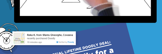
Another way to build trust is by offering social proof such as testimonials, reviews, and star ratings. A landing page can also use live sales notifications that display customer purchases in real-time, like on the Doodly landing page example below.
Image: doodly.com
Make sure to space trust badges and proofs across the landing page; overloading a page with too many recommendations, superlatives, and star reviews can be overkill and might even give the impression of being fake.
Maximize the User Experience
The goal of a landing page is to motivate customers to take a particular action. Therefore, an effective landing page will make it very easy for the user to take that action. This may seem obvious, but many landing pages overcomplicate their purpose.
It’s not just about providing clear, bold CTAs. It’s also about creating simple lead forms that are quick to complete. For example, an autofill function makes it easier and, therefore, more tempting for users to complete the form. Providing fast checkout and convenient payment options can also encourage conversions.
The Masterclass landing page displays its main conversion button (“Get Started”) in a bold red, so it stands out. The other buttons positioned alongside it provide different ways for potential customers to get engaged and convert, like watching a trailer of a video course or signing up someone for a gift.
Image: masterclass.com
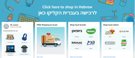
Personalization is another powerful tactic that can be used with landing pages to boost customer satisfaction and retention. Past customers can be retargeted with customized landing pages based on previous online activity or even location. Amazon, which recently launched in Israel, uses this tactic with Israel-based customers, promoting local sellers, brands, and personalized product suggestions in the local language too.
Image: amazon.com
Track and Test
The only way to be sure if a landing page is effective is to track and test its performance over time. Start by defining the goals and setting measurable KPIs. Consider a landing page aimed at parents where the goal is to get them to take advantage of a limited-time offer to a kid’s subscription box service. One KPI might be 100 new subscriptions per month.
Once the KPIs are defined, the landing page can be A/B tested and optimized for various parameters to maximize its effectiveness. Many elements make up a landing page, including headlines, CTA buttons, graphics, colors, font sizes, and much more. Be sure to A/B test just one element at a time, for example, the CTA wording or the color of the headline. This will provide an accurate indication of the performance of the specific element with no interference or skew from other elements.
Landing pages are a critical part of any growth marketing strategy — 48% of marketers build a new landing page for each marketing campaign they run. Companies that are serious about digital marketing might run dozens of landing pages at any given time — each one an investment of time, manpower, and resources. With so much going into each landing page, why not do everything available to make each one as powerful as possible? By following a few basic steps, like those above, brands can boost conversion and, more importantly, build the trust of its customers.