AdRoll vs. The Trade Desk: Comparing Pricing, Features, and Benefits of Two Top DSPs
AdRoll and the Trade Desk compete head-to-head on many features. Our guide covers DTC advertising, ecommerce, ABM, privacy, channel coverage, and pricing.
Read More

Web design has the power to make or break a storefront’s ecommerce sales. That’s why many of us flock to clean, intuitive, and modern sites like Amazon and shun anything designed earlier than 2010 — the ones with glitchy graphics, blinding colors, and 3D text.
Though most web design basics are rooted in the core principles of art and design, you don’t need an MFA to build an aesthetically pleasing website. Instead, it’s about knowing what to pay attention to when it comes to the right colors, typography, and composition. The best part? Unlike the sites of yesteryears, you’re not restricted by snail-speed internet speeds and limited browser capabilities.
Let’s jump into the world of web design and get started with some strategies that’ll instantly level up your ecommerce store.
Color theory refers to the art and science of color, namely how different colors can spark emotion and impart personality. Read on to see what colors can do for you — and what to avoid.
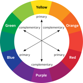
The color wheel is your guide for picking eye-catching shades that complement, rather than clash, with one another. It features 12 basic hues: three primary colors (red, yellow, blue), three secondary colors (green, orange, violet), and six tertiary colors (red-orange, yellow-orange, yellow-green, blue-green, blue-violet, red-violet.)
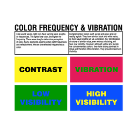
Complementary colors are two opposite shades from the color wheel: red and green, blue and orange, yellow and purple. When placed with each other, they create the strongest contrast — the key to establishing hierarchy and drawing the eye to focal points.
When you use bold, super-saturated color palettes, adjacent colors appear to vibrate and lose their crisp contrast — which make them painful to look at. To avoid overpowering your website, limit the number of bright colors. Instead, use lighter hues for backgrounds and stronger primary colors for key elements like buttons.
Like complementary colors, contrast gives a website a sense of depth and helps guide users’ eyes around the page. Beyond playing with colors themselves, consider experimenting with warm or cool tones to create a sense of balance and interest.
Restaurants love the color red because it drives hunger, while tech companies rely on shades of cool, calming blue. But it’s important to note that colors aren’t universally interpreted across cultures: Red can be a symbol of hunger but also anger and passion. Before choosing colors for your site and brand — especially important ones, such as your logo — you’ll want to understand your audience and how they interpret colors.
Typography relates to all things related to type and formatting. Good typography can go a long way in making sure your message is readable by your audience.
Legibility — which includes font size, typeface, and line height — is all about making typography choices to improve a site’s usability and readability, playing a vital role in increasing conversion rates.
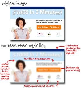
To ensure your website is legible, conduct a squint test: If you have a strong layout, clear hierarchy, and generally legible copy, you should still be able to understand the overall message.
Line spacing, usually measured in points (pt), is the area between the lines in your body copy and headings. To meet accessibility standards, the World Wide Web Consortium (W3C) recommends sites implement line spacing that’s “at least a space-and-a-half within paragraphs,” so approximately 1.5x the font size.
Letter spacing is the space between the letters. Adjusting it helps add some extra personality to your web design.
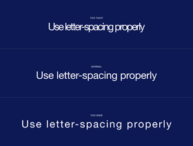
The ideal letter spacing will depend on your font.
Line length refers to the length of one line of text before it breaks into a new line. The ideal line length varies based on font size, but it’s typically between 50 and 75 characters — anything more than that becomes difficult to read, as a user struggles to find where the new line of text starts after their eye reaches the end of the previous line.
While type size 12 is standard for Microsoft Word and Google Docs, it’s a whole other story for web design. No matter what you choose, your type size should be standardized and suitable for different screen sizes (desktop, tablet, mobile).
In general, a body font should be around 16px, the largest headings should be approximately double that (32px), and secondary text (like image captions) should be two sizes smaller than your body font (14px). Start there and adjust as necessary. Remember: The perfect size will depend on your font, but avoid going below 10px.
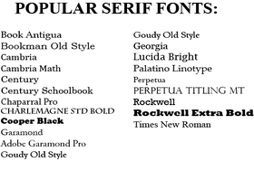
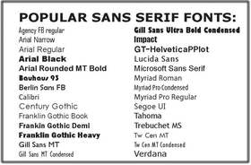
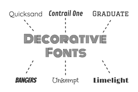
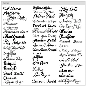
Fonts help set a brand’s tone and personality and generally fall under four classifications: serif, sans serif, decorative, and script.
Rule of thumb: Adding too many fonts to a website will make it harder to navigate and look less professional. We recommend a maximum of three — anything more, and users may exit real fast and think of your brand as unprofessional or amateur.
While the small details, known as serifs, at the ends of larger strokes are preferred when reading on paper, they can be challenging to read on screens. We recommend reserving serifs for larger-sized headings and subheadings, so the serifs don’t get lost on the screen.
Serif fonts are great when you want to evoke a traditional, warm, reliable, and formal tone.
Comparatively, sans serif fonts (referring to fonts without serifs, unlike those we saw above) are easier to read on screens. For ecommerce sites, they’re also a nice alternative to traditional serif fonts, offering a modern, sleek, approachable and humanist feel.
Fun, playful decorative fonts are everywhere, both online and in print, giving off tones as varied as the fonts themselves. A little goes a long way, though — so if you want to add some pizzazz and personality, go for it. Just make sure to keep them far away from body copy.
Script or cursive fonts emit an elegant, formal, and classic feeling, but they’re usually reserved for headings and logos as the dense letters often make it hard to read. So, similar to decorative fonts, script fonts should be used sparingly and in a larger size.
Composition is the technique of organizing visual elements in a way that leads the eye where we want it to go. Here are a few good rules to keep in mind when composing layouts.
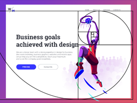
The rule of thirds involves dividing up your available real estate into nine equal parts. Your most important elements should be placed on the left or right “third” of the page.
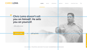
You’re probably familiar with the golden ratio as a mathematical formula identified by the ancient Greeks, often used to achieve a more harmonious design. When relying on the golden ratio — which dictates the sizes and proportions of various elements — you’re ensuring the proportions of your elements are correct. Learn more about it here.
Adding white space serves as a great tool for creating hierarchy and emphasis, helping your message better stand out. Plus, it’s especially useful in giving users a moment of pause when digesting large chunks of text. Use it wisely, though — too much of it, and your site will feel empty.
Visual hierarchy is the process of making your most important elements as clear as possible. It’s a powerful technique for creating a visual story, and it can be achieved with proper spacing, size, and color. To learn more about visual hierarchy, check out this guide.
Pat yourself on the back: You’re now an expert on everything related to web design basics. Now, go forth and replace the Papyrus, oversaturated colors, and cramped layouts with more user friendly, aesthetically pleasing, and intentional approaches.
Looking for more resources to help level up your ecommerce brand? Check out the AdRoll Marketing Resource Library.
Last updated on December 21st, 2021.