AdRoll vs. The Trade Desk: Comparing Pricing, Features, and Benefits of Two Top DSPs
AdRoll and the Trade Desk compete head-to-head on many features. Our guide covers DTC advertising, ecommerce, ABM, privacy, channel coverage, and pricing.
Read More

Search for quotes about design, and you’ll inevitably come across this one: “Good design is obvious. Great design is transparent.” The saying is popular for a reason — from products to websites, the best ones are never too loud or garish. Instead, they deliver an inconspicuously satisfying UI and UX.
In ecommerce, intuitive interfaces and appealing design can dramatically impact a website’s performance, ultimately leading to higher (or weaker) sales. On average, a customer only spends 0.05 seconds judging your site before deciding to continue or exit. In other words, to make your site seamless, attractive, and memorable, you’ll need to prioritize user experiences (UX) and user interfaces (UI) in the development process.
But what do these terms really mean? And why do they matter? If you want to improve your website performance, conversion rates, and market share, check out these UI and UX design best practices for your ecommerce site.
Both UI and UX design are critical elements in product development. However, many people use the terms interchangeably without understanding what they mean. We’ve mapped out their key differences and how they uniquely contribute to the design process.
UX | UI | |
What does it stand for? | User experience design | User interface design |
How is it applied? | Both physical and digital products/services (e.g., an IKEA shelf, a website, a visit to your store) | Digital products/services only |
What does it focus on? | The full end-user experience, from the first contact to the last interaction | Visual touchpoints that allow users to interact with a product |
What is its end goal? | Design solutions that alleviate the pain points in a user journey, making it a more efficient and pleasant experience | The aesthetics and interactivity of the product, making the interface and visual elements (such as buttons, icons, imagery, animations, typography) as intuitive and functional as possible |
What questions would they ask? | What tasks and steps are users required to take? How can we make the experience more straightforward? Example: How easy is it for someone to assemble these Ikea shelves? Is the checkout sequence of this website too complicated? | How does the product look or feel? Is this font hindering readability? Example: Is this shade of red for the button too jarring? Should this button be larger or smaller? |
To summarize? | The feel of the experience | The look of the product |
Every ecommerce site sells unique products that target specific needs in different audiences. But digital shopping journeys are more alike than you may think. Typically, a shopper:
Enters via a homepage
Explores product pages using the site’s navigational tools
Adds products to the cart
Clicks on “shipping,” “returns,” or FAQ pages
Checks out
Though there will be deviations from this path (some shoppers may browse your sale section, read reviews, or save items to a wishlist), interface elements along this journey must be designed appropriately to eliminate any UI and UX friction.
Ever visited a beautifully designed website that is hard to use, clunky, or counterintuitive? No matter how compelling the graphics or copy are, shoppers’ frustrations will mount if your site doesn’t properly support the browsing and checkout process. For ecommerce sites, UX starts with designing intuitive page navigation.
Today’s ecommerce sites are complex — you have your product, FAQ, shipping, returns, “About Us” pages, and much more. Mega menus of the past will no longer cut it. Shoppers are expecting efficiency, clarity, and easy navigation that adapts to their journey.
Additionally, navigation serves as an important way for users to orient themselves to a site, especially if they entered the site via a product or landing page rather than the homepage. Having intuitive navigation gives users the ability to confidently predict where they can go and what they can do, rather than blindly clicking away and just hoping for the best.
Beyond developing familiar category names, a straightforward menu structure, and a simplified site hierarchy, here are some additional ways to ensure your navigation is as optimized as possible:
Not everyone will spend the time clicking through categories to browse 1.your entire product catalog. Instead, you’ll have shoppers who know exactly what they want, whether because they are strapped for time, are a returning customer, or can’t find the specific products they need. To help streamline the consideration process of these shoppers, consider:
Having the search bar available on every page.
Putting the search bar in a highly visible position.
Developing a search bar that serves suggestions before the shopper finishes typing. (Note: This requires matching keywords to product categories or even specific products.)
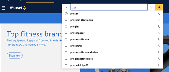
Walmart’s search bar suggests product categories.
Breadcrumbs are a site navigation element that makes it easy for shoppers to know where they are — they’re vital if you have an ecommerce site with many sub-pages nested within more sub-pages. They can be pretty basic, such as simple text that shows what pages and subpages shoppers are in:
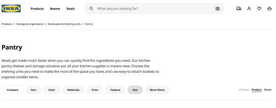
By placing breadcrumbs on the top left corner, right under the logo, IKEA guarantees you can easily navigate from smaller sub-product pages.
Equipped with the information from breadcrumbs, shoppers can better find the categories, products, and pages they need to continue on their customer journey without clicking around aimlessly.
Product filters are a must-have, especially if you have a large and complicated inventory with products in various colors and sizes. By narrowing down the number of products, filters can help shoppers feel less overwhelmed and find exactly what they want or need.
You can sort by price, best value, popularity, or newest arrivals. Similarly, you can include filters for size, color, price range, or even style.
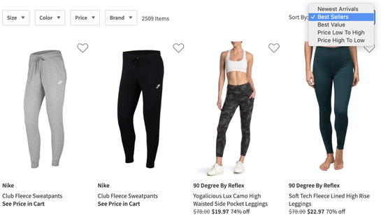
Nordstrom Rack offers comprehensive sorting and filtering options that allow their shoppers to dig through the clutter.
It’s not enough to just consider the types of filters you implement. You also have to determine what your filters will look like — will it be a left sidebar, a “hamburger” menu on the right, a row of buttons above the results, or something else? When deciding the style of your filters, make sure that:
Your filters don’t take up too much room, as your products should be the hero of the page.
Your style of filters is the same across devices. Consistency is a crucial UI design element, which can be challenging because of limited mobile and tablet space compared to desktop.
Footers are an important piece of real estate that deserve more attention than what you may be giving them. Over the years, shoppers have been cued to scroll directly to the bottom of the page when searching for important links and contact information, no matter how kooky a site’s design is. As a result, footers may counterintuitively be the easiest-to-see landmark on your website.
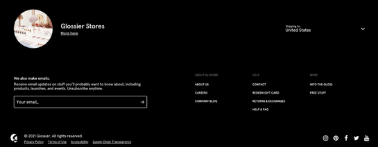
Glossier’s clean and simple footer has all the key information shoppers need.
Your footer can be extremely simple, but it must provide the core elements: contact information, quick links to key pages (FAQ, shipping, returns), and social media icons. If you’re looking to collect customer email addresses, you’ll want to add the subscription box at the footer as well.
Your website should indicate to shoppers what you want them to do next, which is why having highly visible and eye-catching call-to-action (CTA) buttons are critical:
Experiment with buttons, arrows, or underlined links.
Make it catchy and visible in a way that stands out from your other content.
Use power words that trigger shoppers to take the next step instead of exiting the page.
A/B test different placement locations.
For more on creating a compelling CTA:
Beyond your homepage hero copy and visuals, your checkout page is arguably the second most crucial aspect of your website. A poorly optimized checkout page causes friction that prevents users from painlessly achieving their goals, making it all the more likely that someone closes the tab (and increases your checkout abandonment rate!).
To ensure a smooth checkout process, you’ll want to:
Reduce the number of pages and steps that shoppers have to complete before they can check out.
Allow shoppers to check out as a guest, instead of forcing them to create an account.
Add a progress bar to set expectations.
Provide a variety of payment options, including Paypal and even payment plans, such as Afterpay and Klarna
Allow shoppers to add or remove items easily without having to redo the entire checkout process, in case they change their minds.
Include easy links to shipping and returns pages.
For more on checkout abandonment:
Strong branding is what you should strive for in all your marketing materials and campaigns, but it’s doubly important in your website. This doesn’t mean just plastering your logo wherever possible — it means actively designing your site in a way that expresses your brand identity, voice, and values.
Here are some examples:
Develop a site experience while considering who your customers are, what they are looking for, and why they choose you over your competitors. With that, you may feature certain products more prominently, highlight certain features over others, or add widgets that are applicable to your customer needs.
Write copy that reflects a prominent brand voice. Is your brand cheeky and humorous? Or is it authoritative and assertive? Brands with a strong voice will be more memorable.
Be consistent. Whether it’s a color palette, iconography set, or typography usage, you’ll want to be consistent throughout your site. It’s worth the time to develop a brand guide, so all your UI and UX designers, site developers, and copywriters are on the same page.
Feature your logo prominently — without going overboard. Most retailers opt for the top left corner of the site.
For more on how brands can make a strong first impression:
Numerous studies and surveys show that people read and browse websites in an F-shaped pattern, viewing screens from left to right, line by line (almost like a book!) Fun fact: This phenomenon is flipped for users who read right to left languages, such as Hebrew or Arabic.
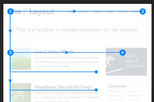
Here is what the F-shaped pattern looks like. From: UX Planet
In terms of UI design, here’s how to use the F-shaped pattern to boost engagement rates:
Place essential information on the left side of the screen (which is why logos frequently go on the top left corner!).
Put headlines that convey your brand values, product benefits, or other key information on the left and supplemental images on the right.
Don’t be afraid to use “negative” or “white” space. You don’t have to fill up your website with as much content as possible. Negative space can break up large chunks of text or images in a section, making the page easier on the eyes. (P.S. White space doesn’t have to be aesthetically white in color!) Target’s website keeps its hero section clean and straightforward, with the headline, subhead, and CTA on the left, and images to support the story on the right.

For more tools to create amazing website creative visuals and up your UI and UX game:
Platforms like Shopify and BigCommerce offer dozens of cool widgets that you can add to your site, from pop-ups to lightboxes and chat boxes that promote sales, encourage newsletter sign-ups, or offer help.
It can be tempting to add as many of these marketing features as possible to your site, but remember — sometimes less is more. Widgets that shoppers have to close manually can quickly feel overwhelming and annoying. Before adding anything to your store, you’ll want to keep these best practices in mind:
If possible, add non-intrusive widgets that can be stored away in corners at the bottom or side of the page and only open when clicked. Use clear iconography, so people know to click on the widget if they need assistance.
Don’t bury the X button to close the widget by making it very small or in a similar color to the box. That’ll just add to shoppers’ frustrations.
You can design widgets that only appear after a certain amount of time. For example, you can code a “Do you need help?” chat box that shows up after someone has spent a few minutes on a product page.
Your ecommerce website is, hands-down, the most important marketing property you own. It can be tempting to add as many features and content as possible to ensure you’ll captivate your customers enough to convert but remember: Great design is transparent. Keep it simple, memorable, and intuitive, and you’ve got yourself a winning strategy.
Once you’ve reviewed your website’s design, it’s time to improve your site’s backend to make sure it can be easily found on Google and other search engines. Check out our ultimate guide to website optimization in Q1 so you’re prepared for growth this year and beyond.
Last updated on December 2nd, 2022.